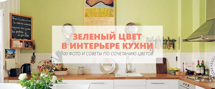
Green is the most common color in nature - the color of life, freshness, strength. Being formed from the mixing of two opposites - warm yellow paint and cold blue, it is the personification of harmony and balance. This is the perfect color for the design of the working areas of the house - the kitchen and office. Kitchens of green colors tend to invigorate and improve mood in the morning, and in the evening - to calm and tune in to rest.
- Green color in interior design is considered one of the most versatile. Professionals appreciate him for his ability to animate, soften and add immediacy to thoughtfully thought out spaces;
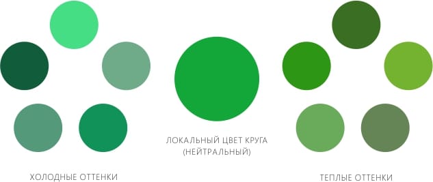
- This color has an incredible number of shades: emerald, jade, jade, apple, lime, olive, pistachio, lime, mint, pear, khaki, etc. By combining different variations of green with other colors, you can create different moods and visual effects.
Our goal is to use these properties as efficiently as possible and create the desired atmosphere by selecting the right complementary colors to the desired green shade.
For those who are in the process of searching for ideas for their new, future or already existing green kitchen, we have compiled a list of the most successful combinations and collected a large selection of photos of successful "green interiors".
See also the material: Olive cuisine - 10 tips for a successful design
5 general rules
Creating a "green design" kitchen you need to keep in mind a few recommendations:
- Ideally, if you are in the planning phase of a green kitchen design, then it is advisable to start with headset selection, furniture, apron, countertops and technology, and only then begin to search for tones of paint or wallpaper;
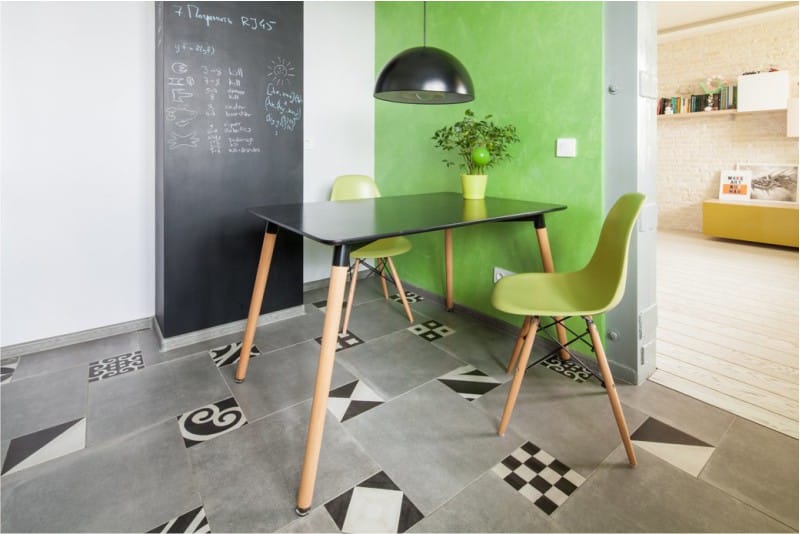
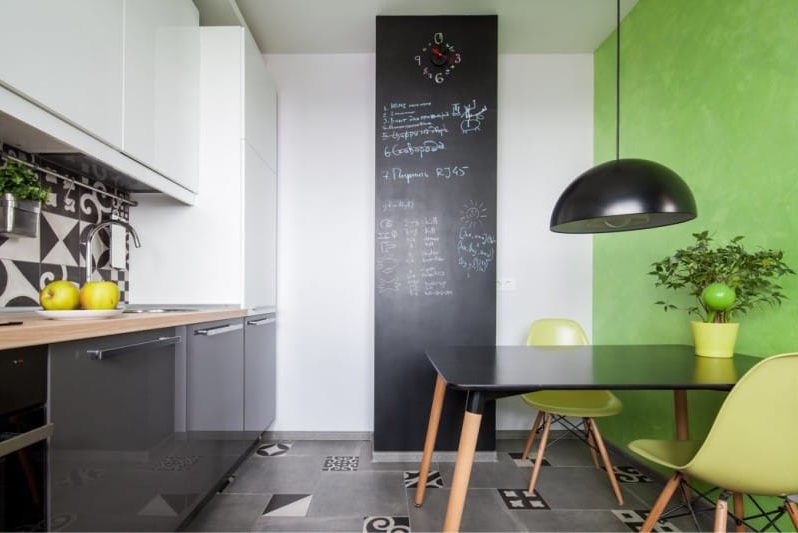
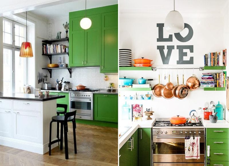
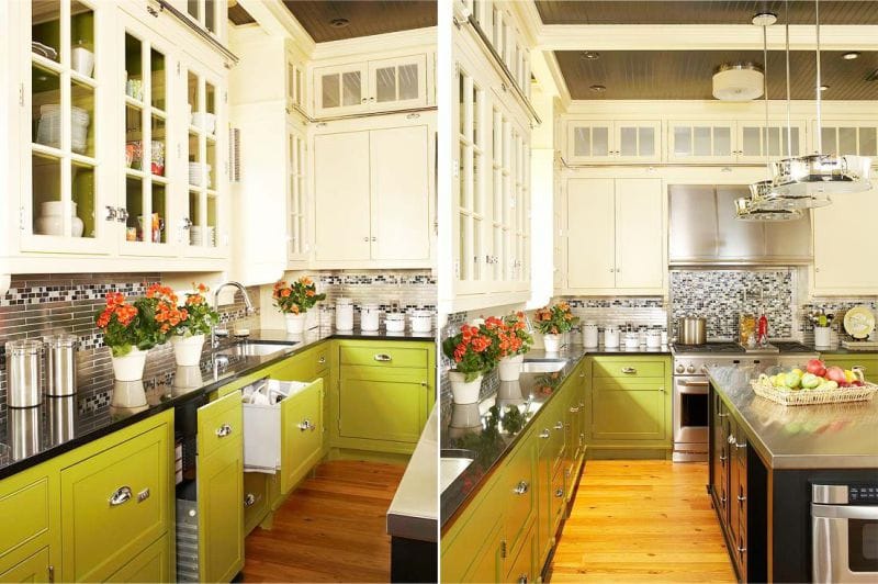
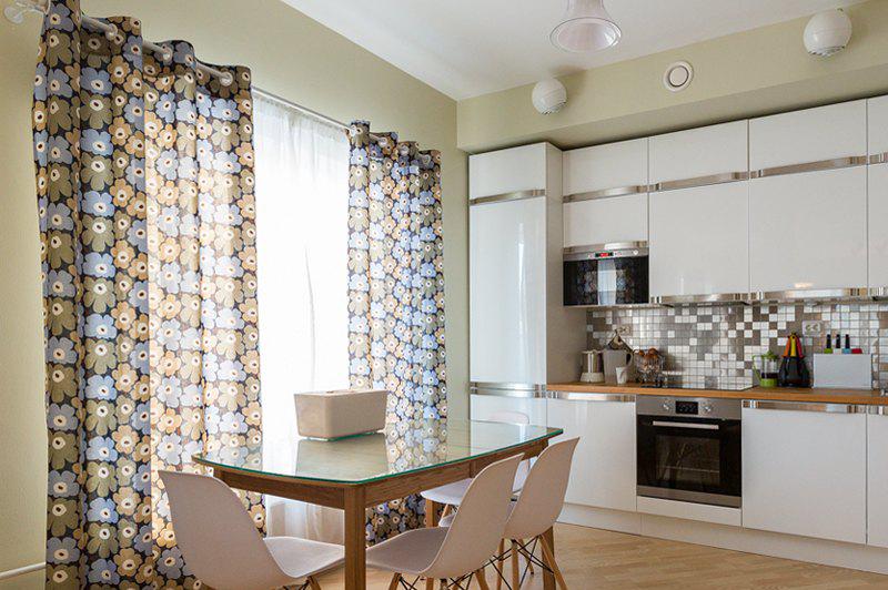
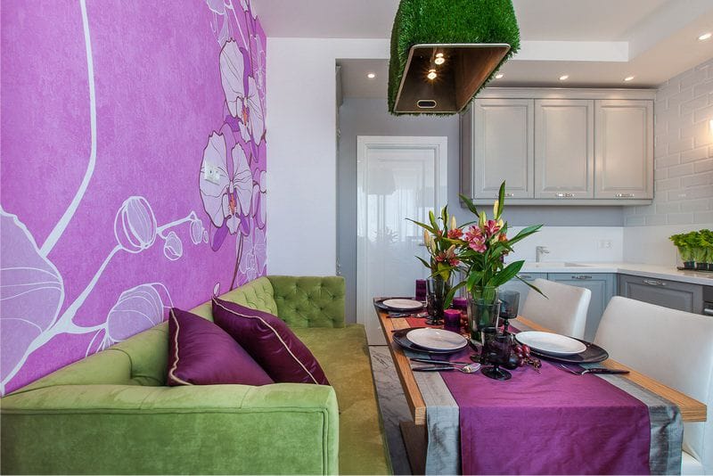
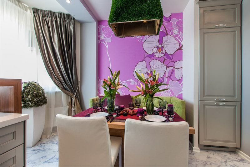
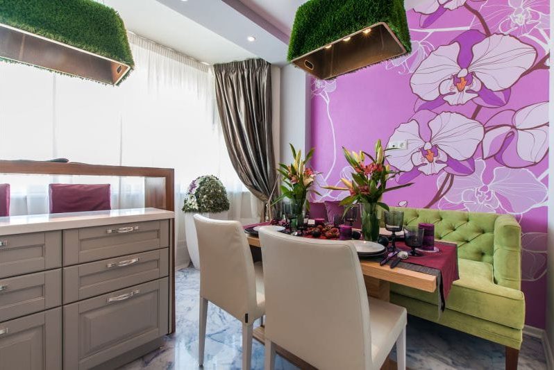
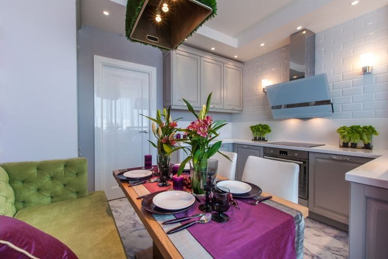
- With all the universality of green, you need to consider some of the subtleties of applying its shades. Bright green tones (lime, ripe pear color, chartreuse) are not desirable for decorating large surfaces. With such active shades you can draw only an accent wall in the kitchen of a discreet scale (example in the photo below). And dark green ones (myrtle, coniferous, aspragus, etc.), on the contrary, are revealed on large surfaces.
- For the design of the kitchen, facing the south, green tones with a greater share of blue should be used, that is: turquoise, mint, gray-green, jade, malachite, emerald, mossy. And for kitchens facing north, green shades with a predominant yellow note, that is, olive, marsh, lime, chartreuse, pear, are suitable.
- Try to stick to the rule: muffled, dusty, and also deep, dark shades are appropriate in the interior of strict, classictraditional minimalistic or male kitchens.
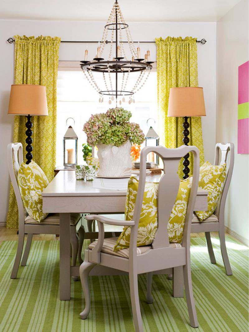
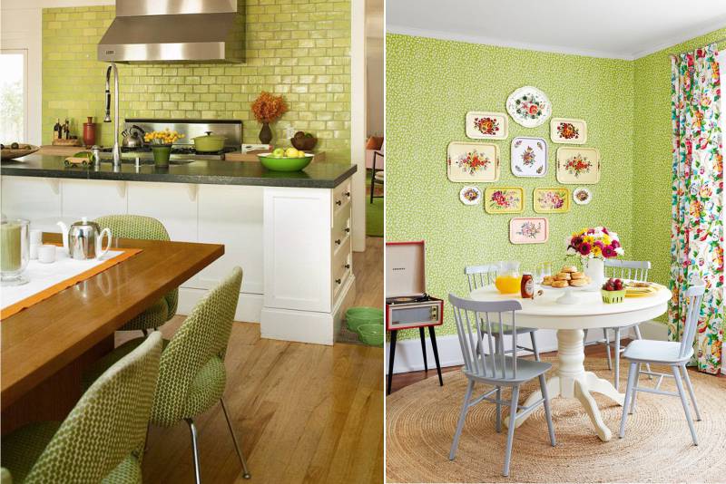
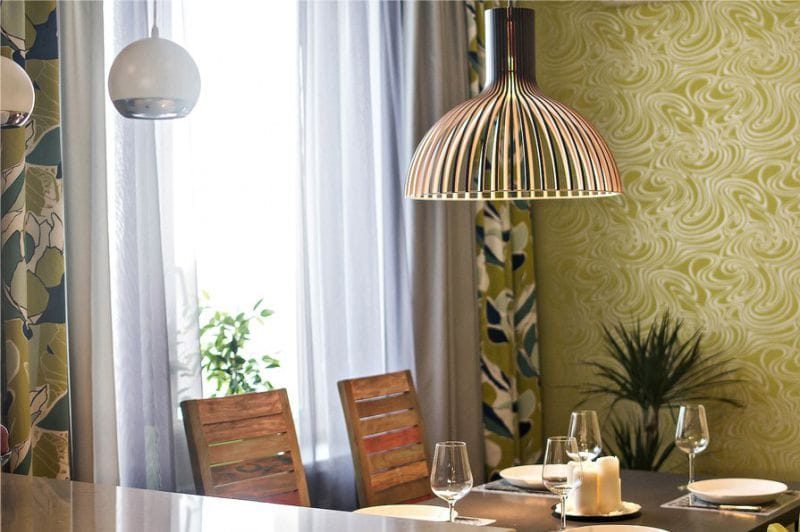
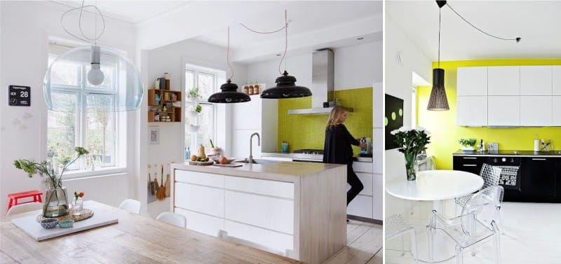
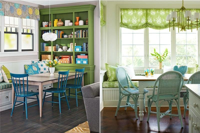
The predominance of clear, bright colors is more suitable for modern styles, for example, Scandinavian. Although, this is probably not the rule, but only a recommendation. Take a look at the following photo of a classic and at the same time modern dining room.Pistachio and lime combined with a beige background and accents in the form of orange and pink look quite harmonious.
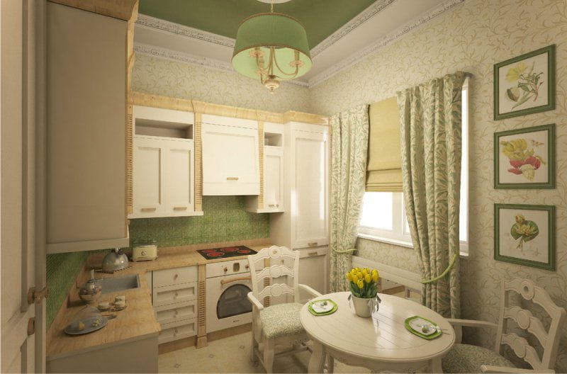
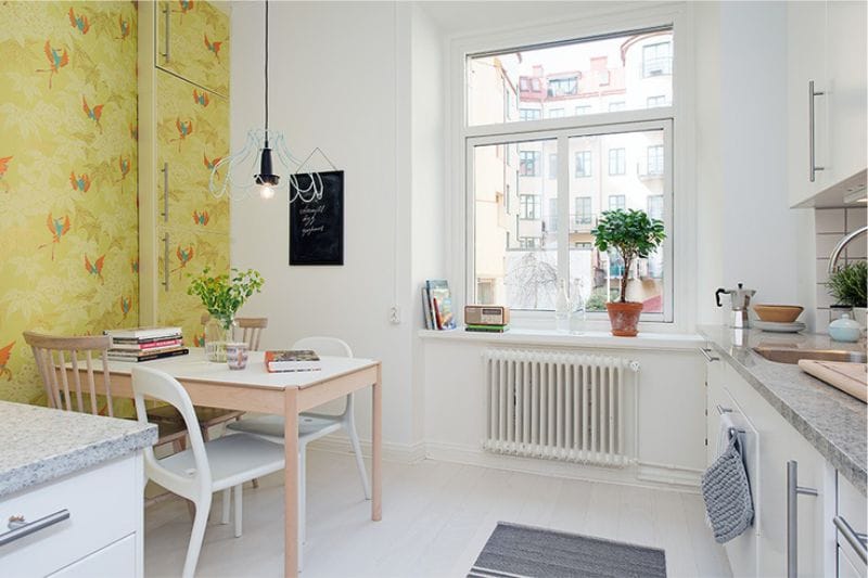
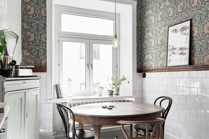
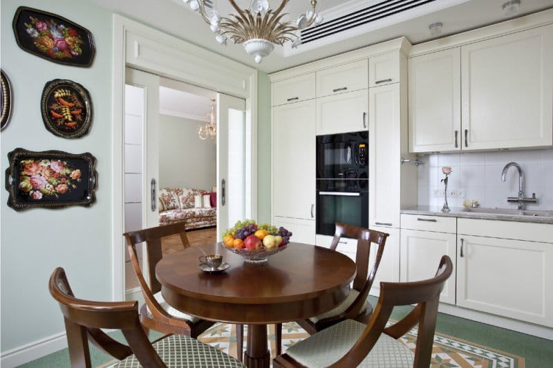
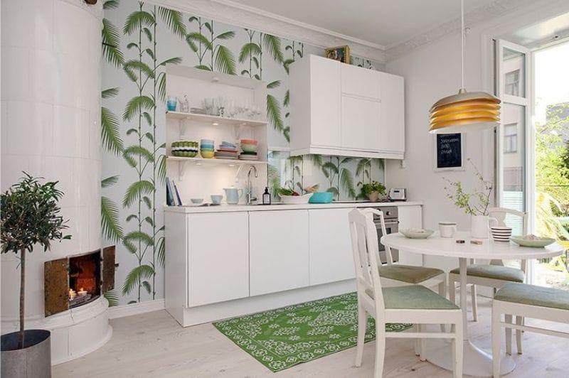
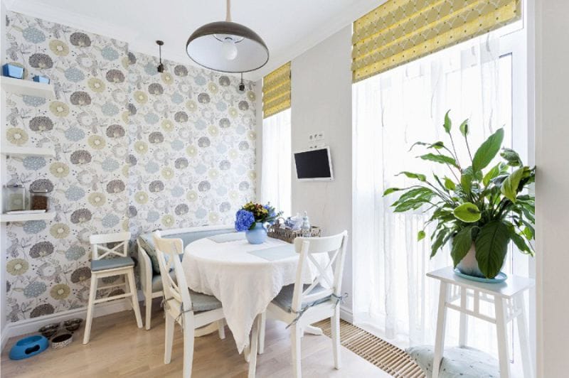
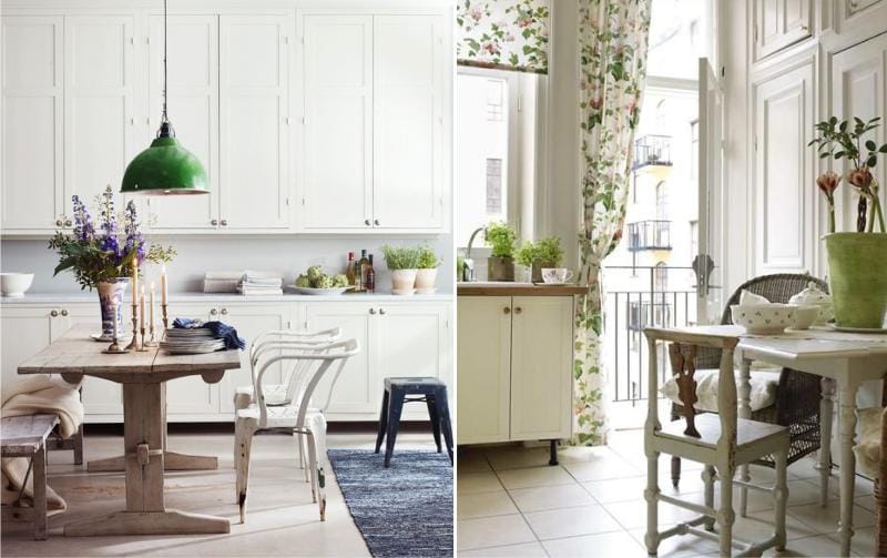
- If large spaces can be made out in any range, then small kitchens can be made only with a predominance of light shades. For example, the kitchen may be white, and the walls are light green. Or vice versa: the kitchen is green and the walls are white. If this is a green wallpaper, then they should have an unobtrusive pattern that does not “eat” the space (photo below).
We combine colors correctly
Combination with white - universal and win-win
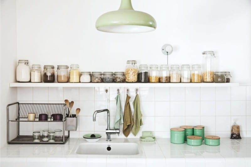
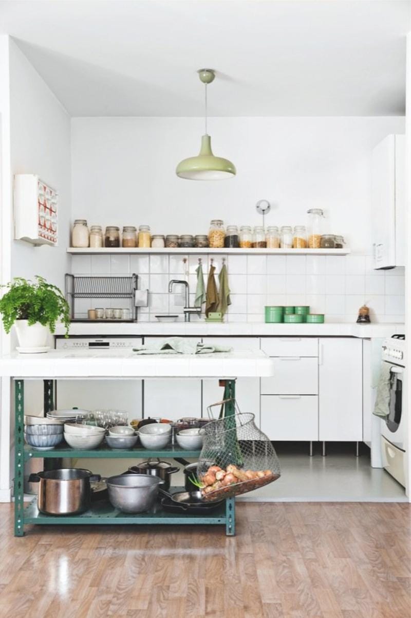
White-green cuisine is the most classic and harmonious combination. To this duet you can add any color accents and not worry too much about the proportions.
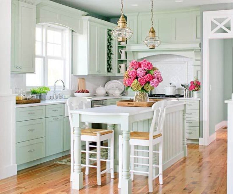
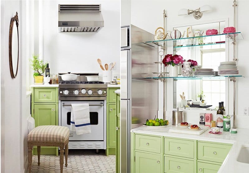
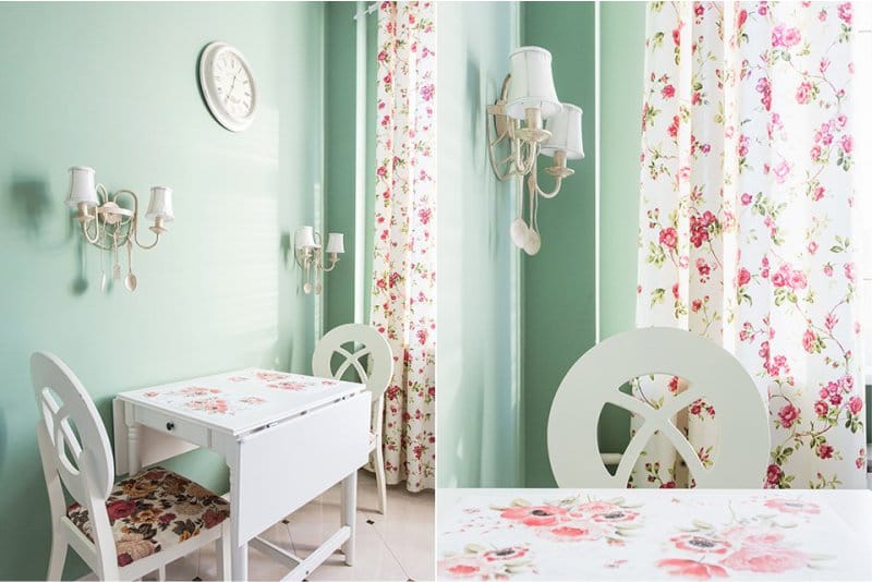
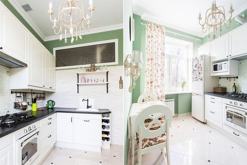
Kitchen pistachio-colored or colder mint in combination with white walls and inclusions of pink looks fresh and tender.
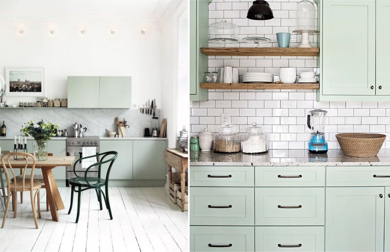
Mint and gray-green cuisine combined with a light finish and wood are suitable for a modern kitchen with a hint of country music.
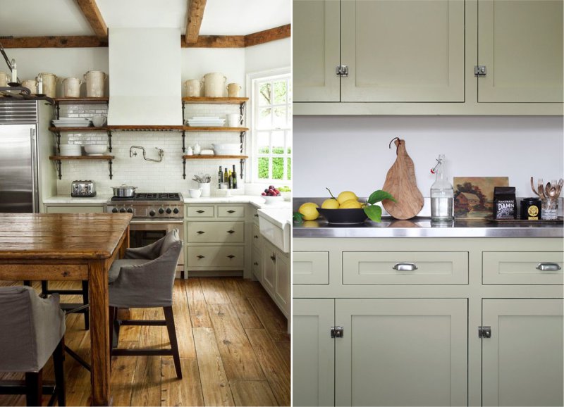
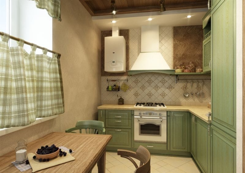
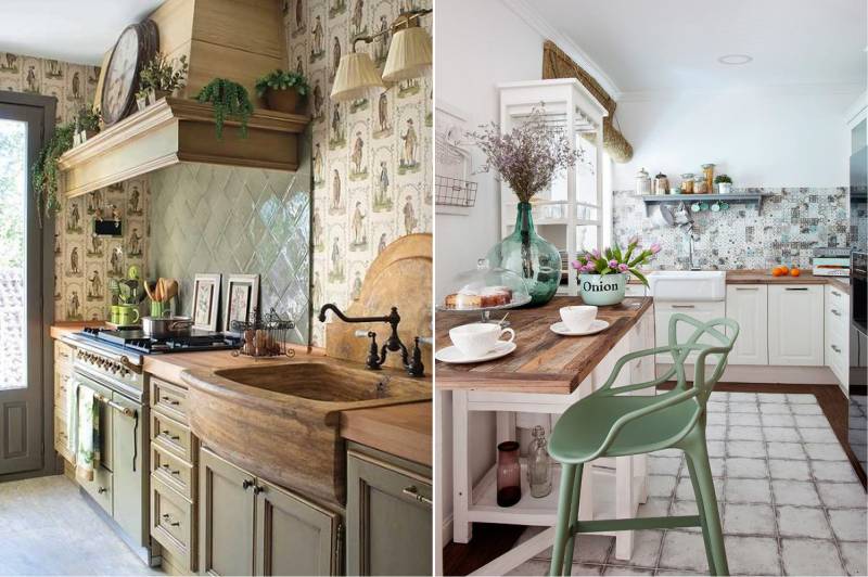
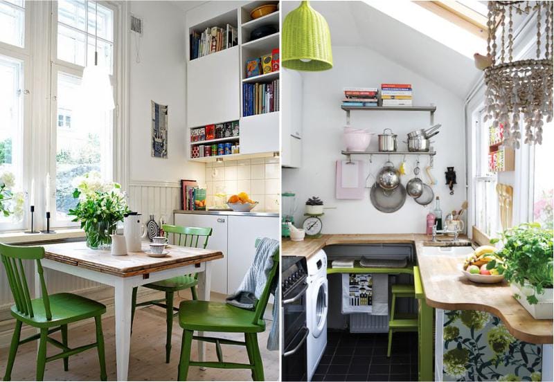
Olive green kitchen looks organic in the interior in country style, provence, english and american classic.
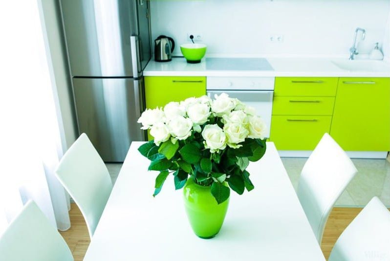
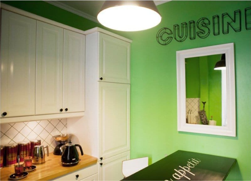
The kitchen in a green color of an almost acidic shade, perhaps, is combined only with a white background.
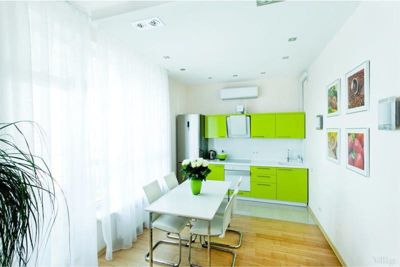
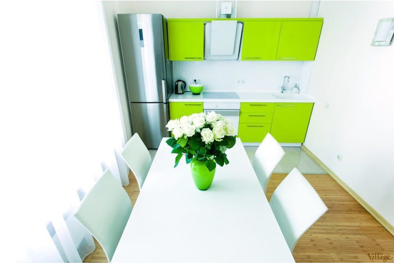
Here are the interesting kitchen with a green bottom and a white top.
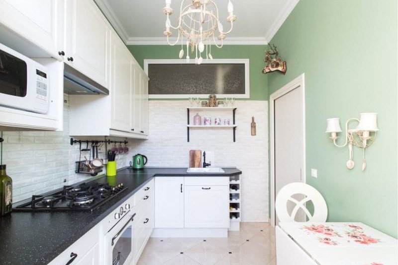
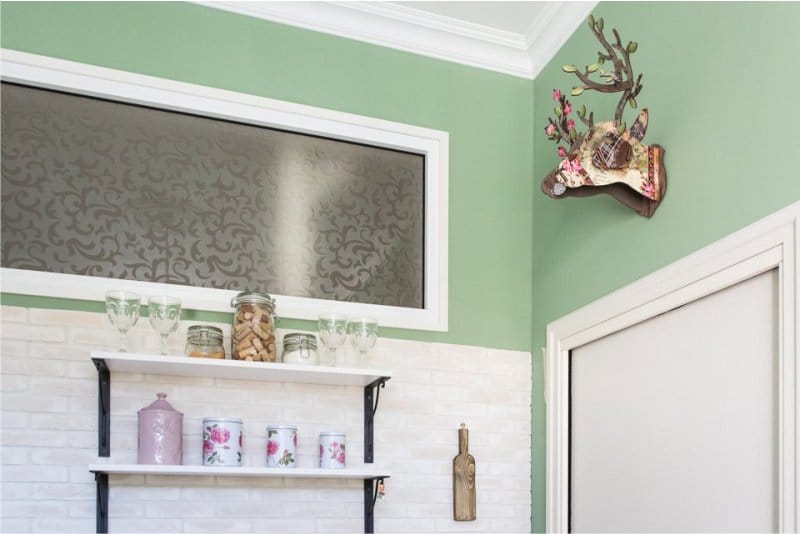
The second version of the white-green kitchen is even more common, when the sets and furniture are white, and the walls are light green, dark green, gray-green, etc.
Pistachio color in the interior of the kitchen, combined with white and warm woody shades, as in the photo below, looks warm and cozy.
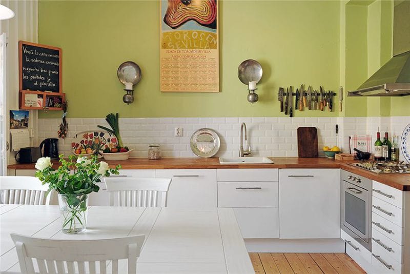
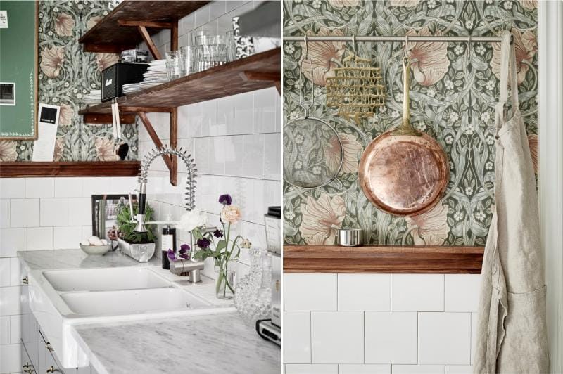
The walls are olive-colored - appropriate in the interior of the kitchen of any style, both modern and traditional.
Bright grassy shade of the walls with a white kitchen.
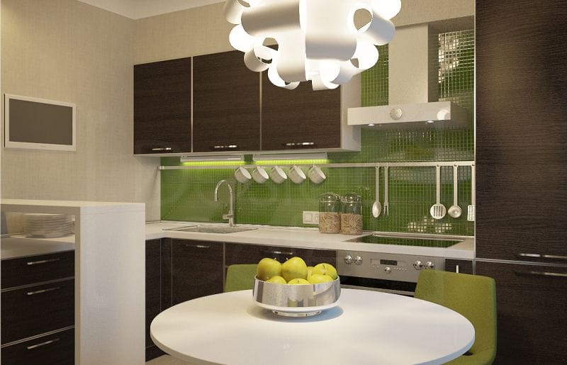
Bright lime, apple, pear shades are very active, therefore they are relevant only on a fragment of the wall.
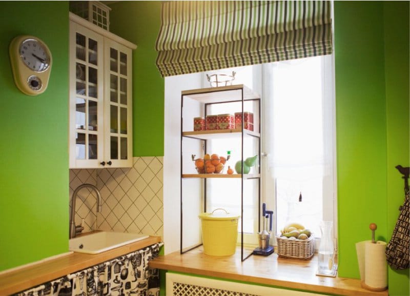
The dark green walls in the kitchen in combination with white look less gloomy. In a small kitchen, dark green wallpaper in half the wall as in the photo below will not make the kitchen smaller.
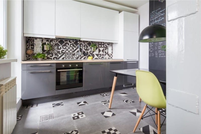
Gray-green and light green walls - this is the base color that will fit into any interior, especially good for small kitchens and classic-style kitchens.
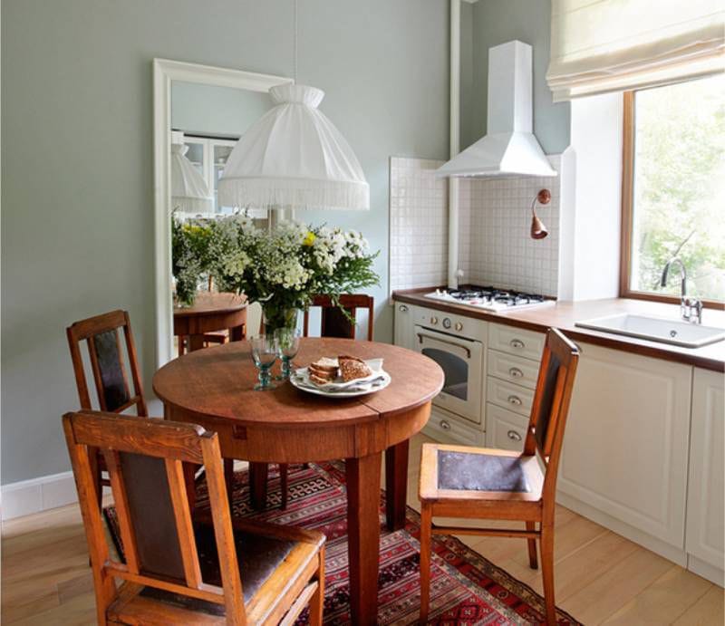
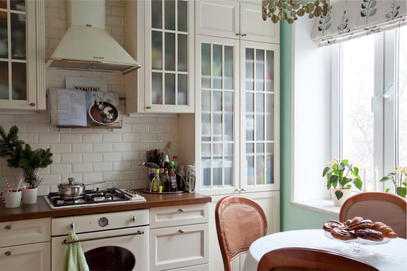
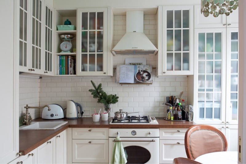
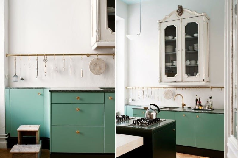
Combination with shades of brown (beige, woody, wenge) - classic and soothing
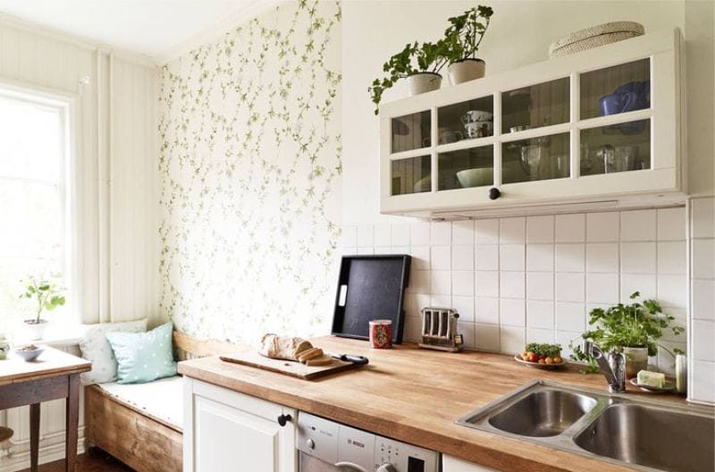
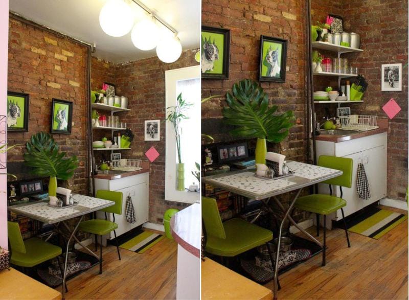
Another classic combination is green and brown or beige colors, which can be presented in the form of wooden furniture, brick walls, tiles on the floor and apron, etc.
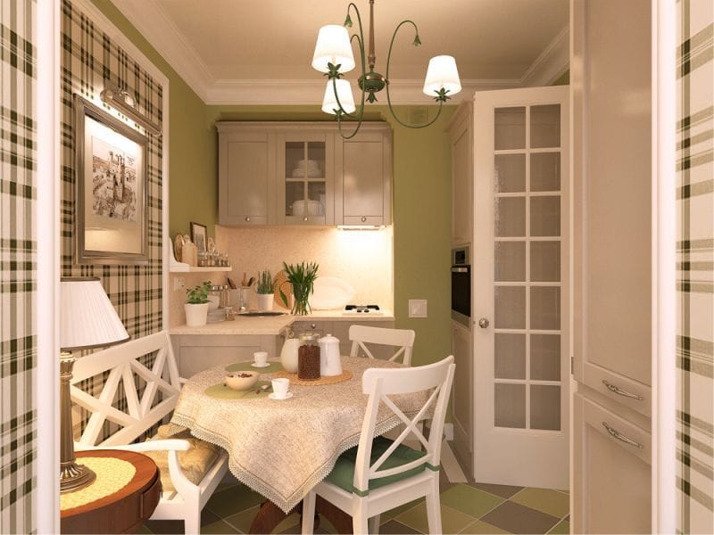
Kitchen beige with checkered green wallpaper.
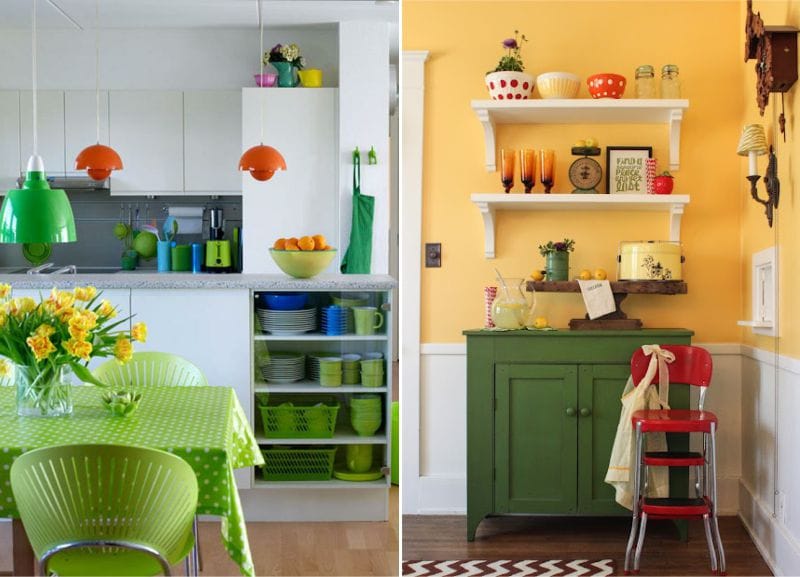
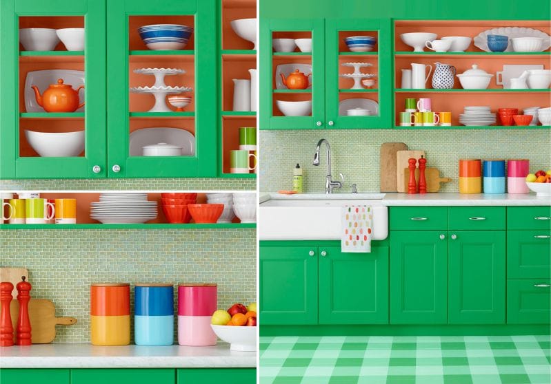
Combination with orange - for a healthy appetite
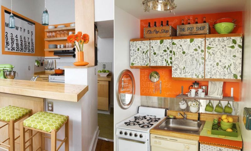
Orange and green are two self-contained, bright colors that are simply created for kitchens and dining rooms, as they increase appetite and mood. In order not to get tired of the abundance of bright shades of lime, pear, grass and orange, use them in a ratio of 1: 3. The best background for this union is white, and inclusions of pink, yellow, blue shades can dilute it.
Combination with pink - for spring mood in the kitchen and in the shower
In nature, pink, like the color of roses, peonies, tulips, sakura and other flowers, is always adjacent to green. Therefore, this is another harmonious combination that is often used in interior design.
To create a spring mood, combine delicate shades (for example, lime, pistachio) with a pink color of different saturation.
Bright mix of lime and fuchsia should be balanced with a restrained background (scroll the photo to the right).
Read more about pink kitchen.
Combination with blue and blue - a symbol of the planet and harmony
Blue and blue, like the colors of the sky and water, harmoniously complement the delicate, lightly saturated green shades in the next selection of photos.
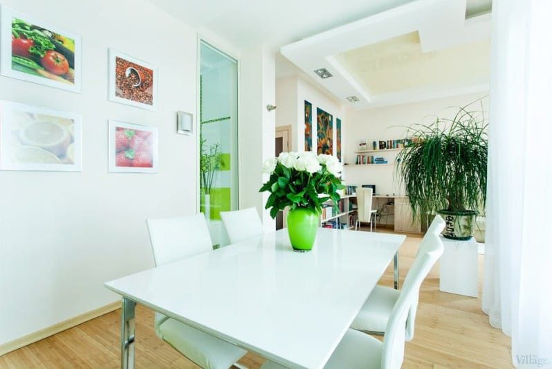
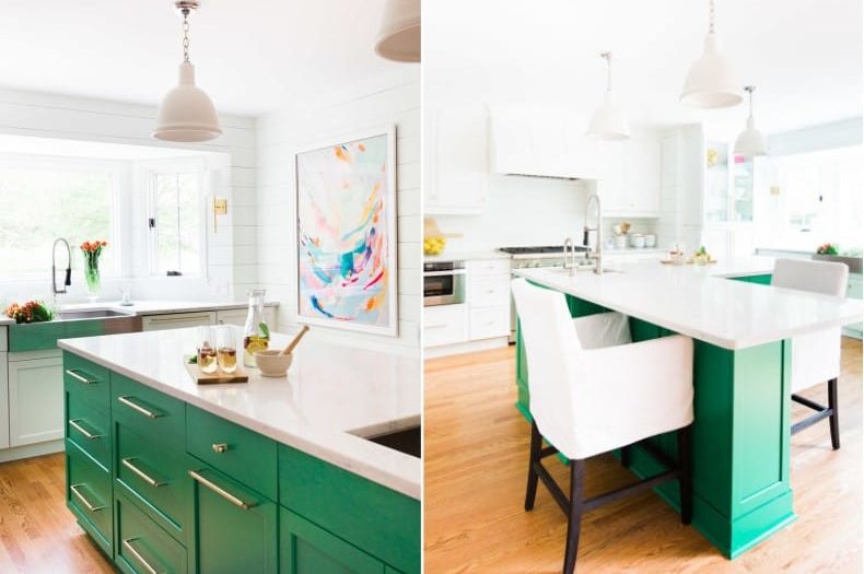
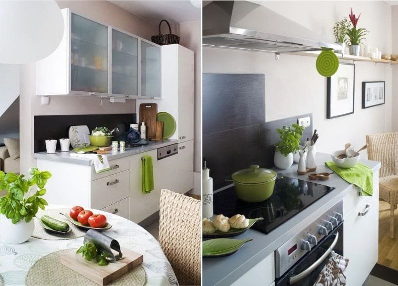
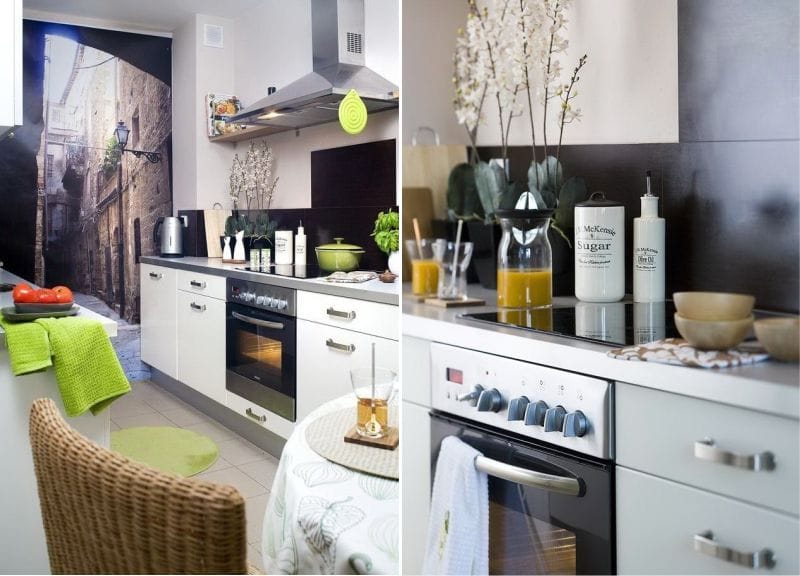
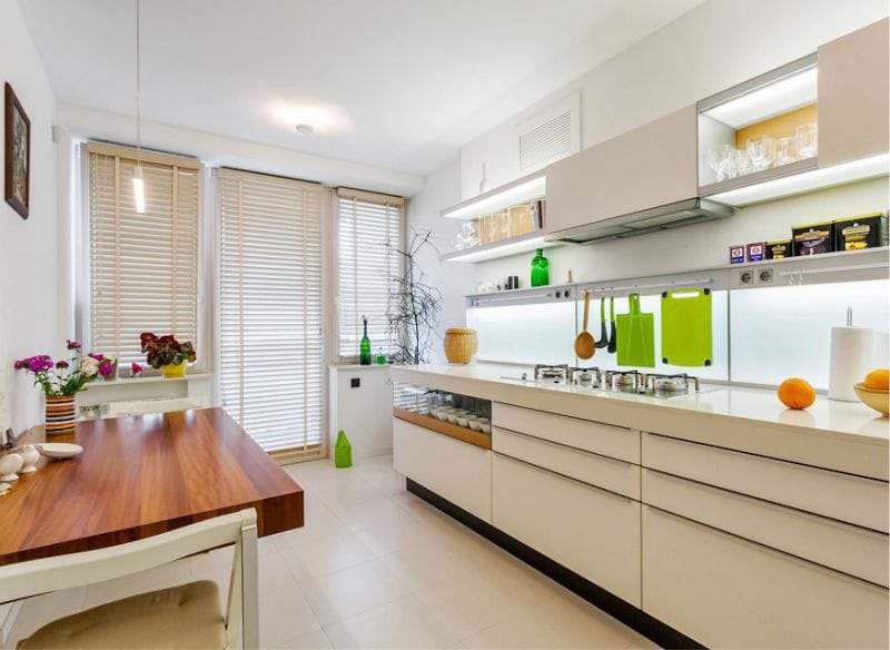
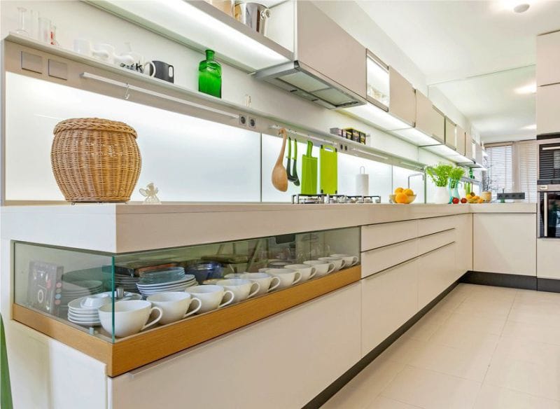
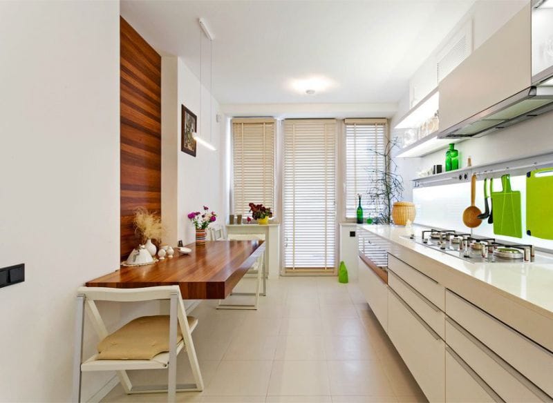
Green in accents
Since this color is universal and combines with all the colors of the rainbow, it can be included in almost any kitchen interior in the form indoor plants, accessories, textiles, furniture and decor.

 (Rate the material! Already voted:70 average rating: 4,46 from 5)
- Color in the interior of the kitchen: bright ideas and traditional combinations
- All about interior design white kitchen
- Yellow color in the interior of the kitchen - 5 main tips and 100 photos for inspiration
- All about the use of gray in the interior of the kitchen
- Black color in the interior of the kitchen - 150 photos, 3 rules and 6 successful combinations
- Beige color in the interior of the kitchen: 3 tips, 9 combinations and 100 photos for inspiration
Fine! Just great!
Really
green color, it directly inspires both cooking and appetite. The kitchen
myself naturally also bought green (in the factory Beaver). You know and
the price is quite normal and the most important thing is that the quality is good. By the way the assembly was free, which of course made me very
pleased). Cooking in such a kitchen is a pleasure!